
Woyage
Woyage is a travel app that utilizes AI tools and digital travel guides to assist travelers with planning, discovering places on-the-go, and sharing highlights of their trip.
Type
Solo Project, Visual Identity, Art Direction
Tool
Figma, After Effects
Solo Project, Visual Identity, Art Direction
Tool
Figma, After Effects
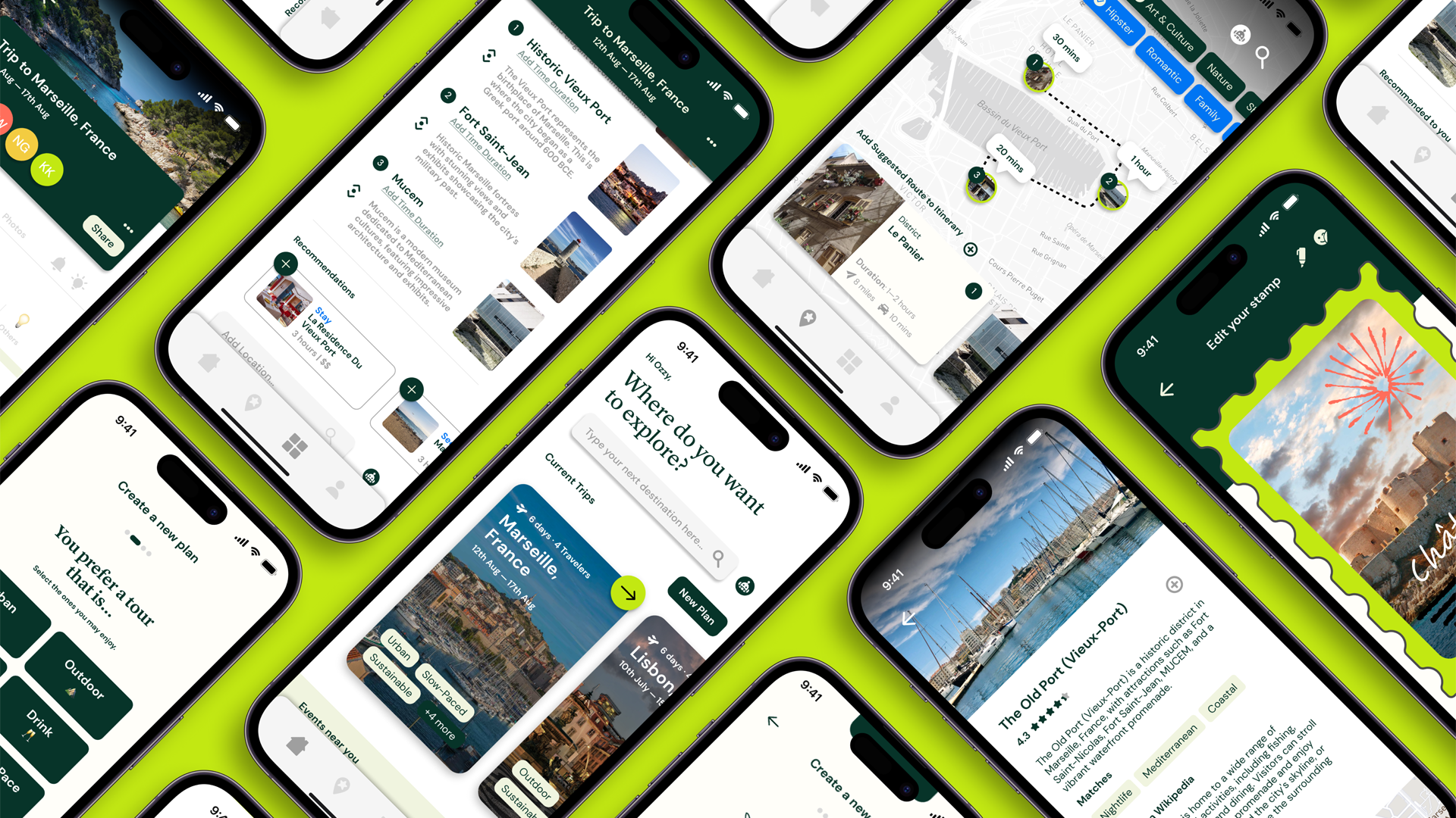

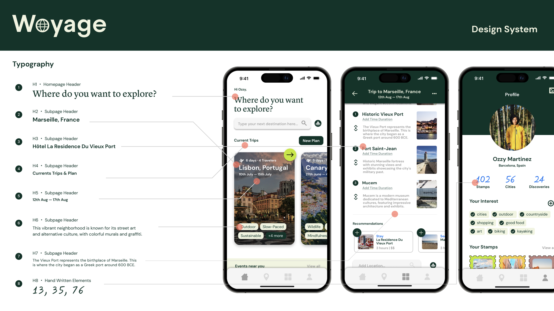
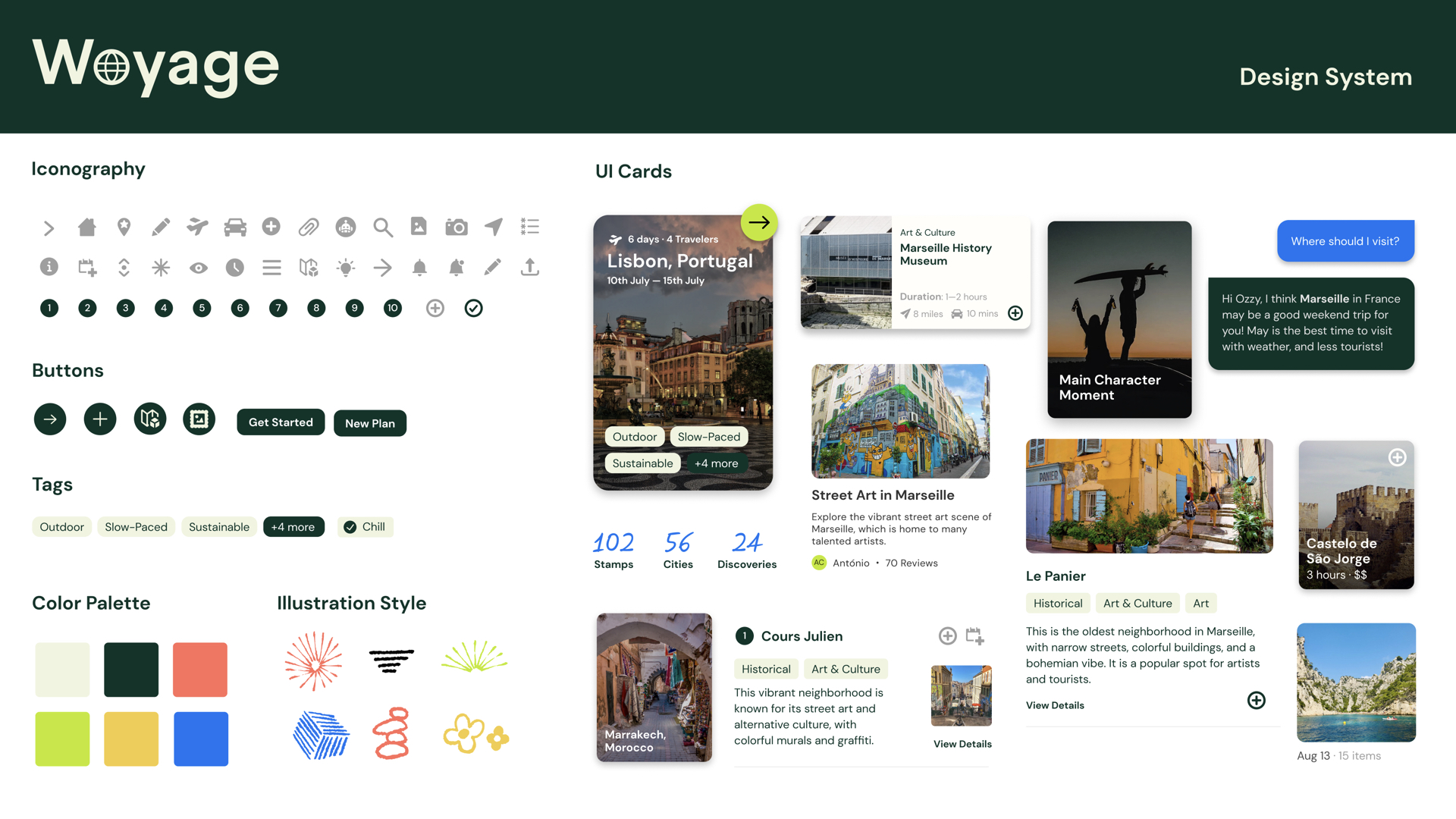
Woyage is a travel guide app for explorors with an on-the-go lifestyle ︎
Overview
Founded in 2006, Wikivoyage (wikivoyage.org) is a multilingual, web-based project that aims to create a free, complete, up-to-date, and reliable worldwide travel guide. Wikivoyage is a part of the Wikimedia Foundation, a non-profit organization that also hosts a range of other platforms such as Wikipedia. The unique experience of Wikivoyage includes a map of nearby places for discovering content under Wikimedia, as well as over 31,791 in-depth travel articles written by the community from around the world.
Wikivoyage is rebranding to Woyage to express the excitement of both 'wow' and 'voyage'.
Oppotunity
How can Wikivoyage develop into a digital travel guide that is more intuitive to use, suitable for on-the-go lifestyle and also provide authentic content that encourages users to be more involved in the community?
How can Wikivoyage develop into a digital travel guide that is more intuitive to use, suitable for on-the-go lifestyle and also provide authentic content that encourages users to be more involved in the community?
︎︎︎
The Trend![]()

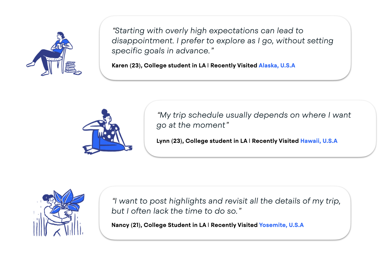
︎︎︎ User Insights
Users would like to see from a travel guide app…
- Highlights of the trip
- See approximate duration of event
- Similar user advice and suggestion
- AI generated Itinerary
Key attributes of an ideal travel guide app…
- Efficient
- Collaborative
- Comprehensive
- Guiding
- Engaging
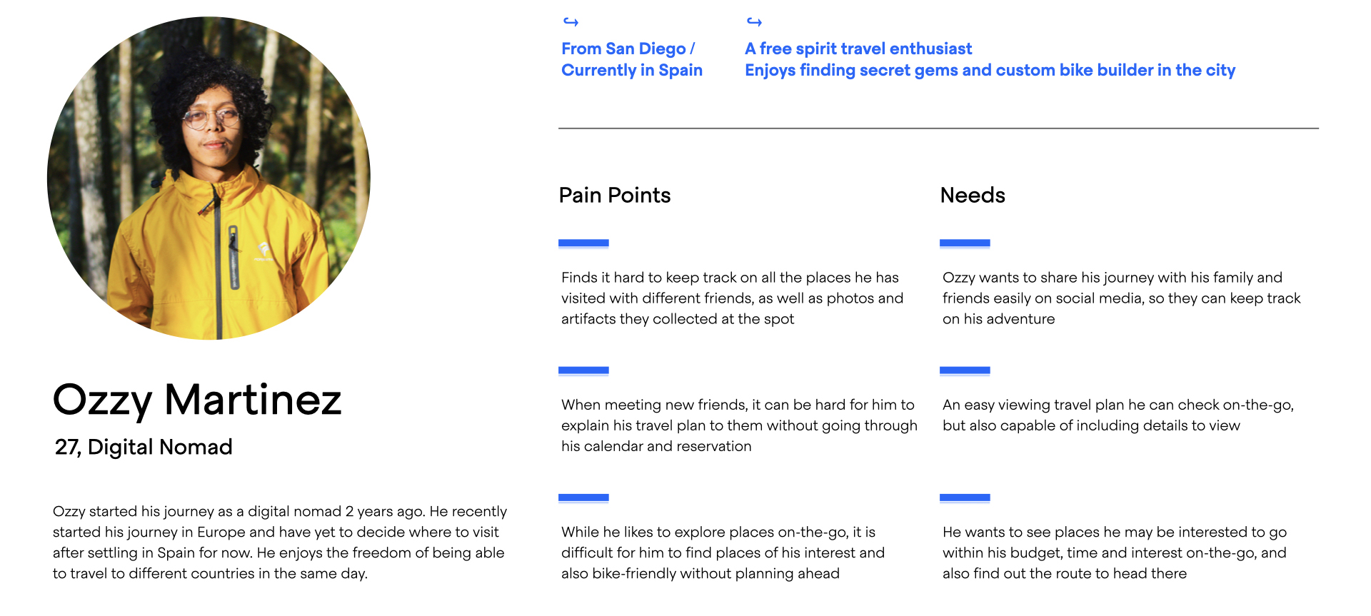
︎︎︎ User Persona
︎︎︎ User Journey
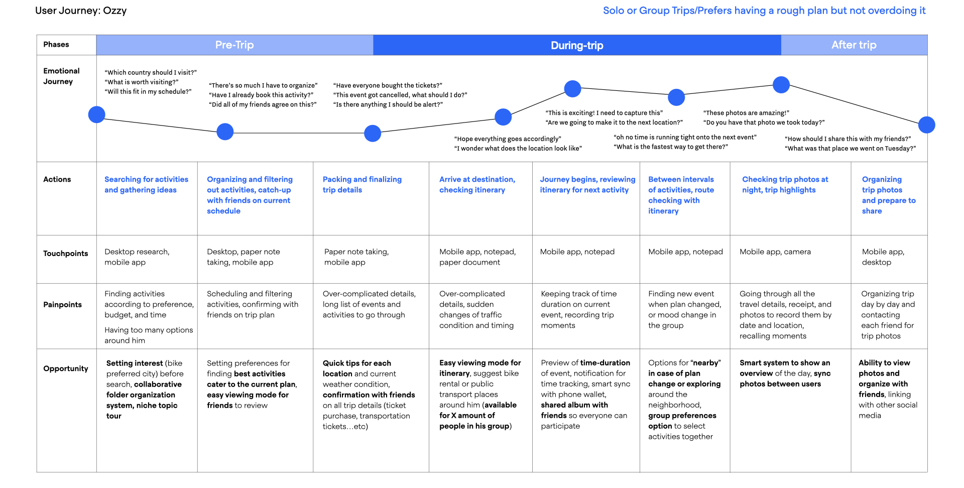
︎︎︎ Pain Points

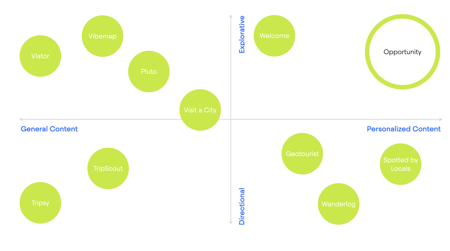
︎︎︎Positioning Matrix
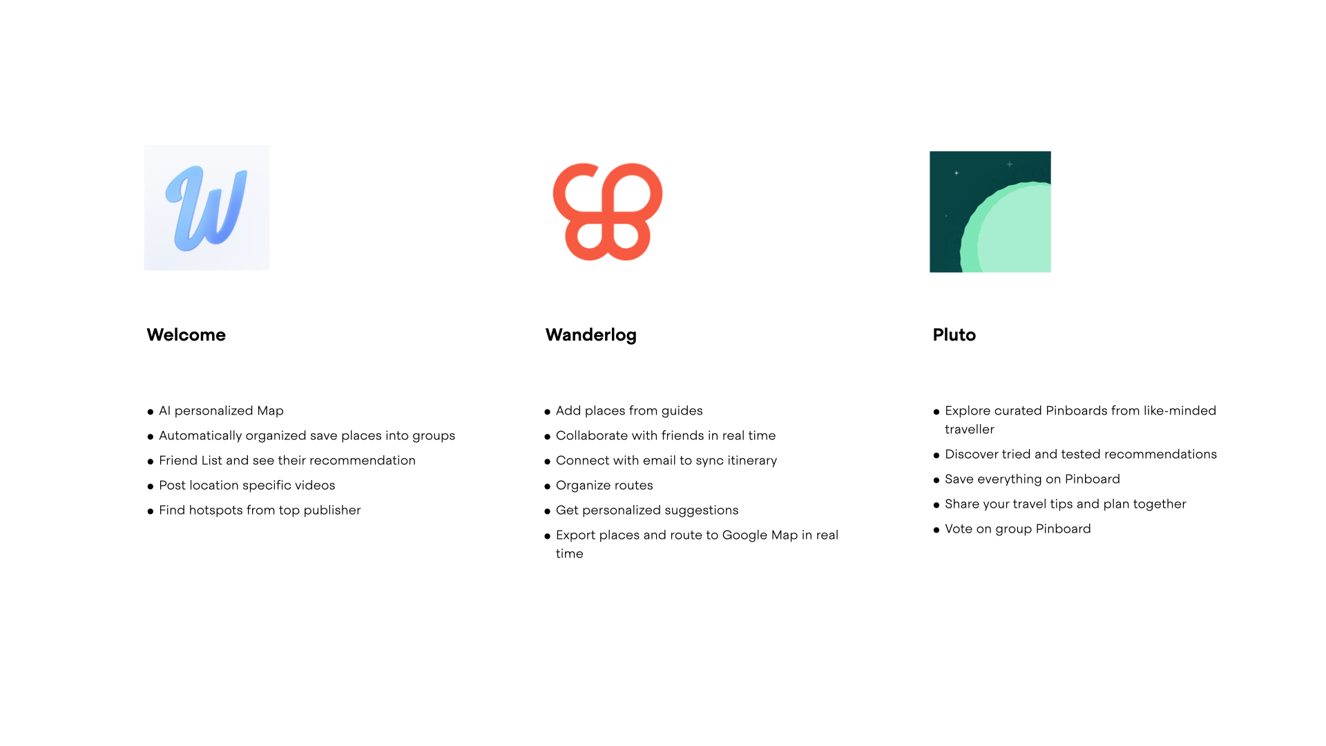
︎︎︎Competitors
︎︎︎Key Features

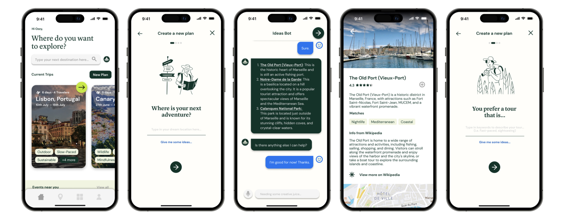
01. Pre Trip
How might we make the trip planning convenient?
Challenges
Solutions
User Insights:
How might we make the trip planning convenient?
Challenges
- Filtering out information in early stage of planning
- Having to brainstorm keywords for searching
- Finding events suitable for group size
Solutions
- Smart AI assistance to show user’s preferences and recommended booking system
- Selection of preferred types of trip like slow paced, fast paced, or niche interest
- Preference for group size and suggest activities based on it
User Insights:
- User also wish to see more events available in the suggested location.
- The creation process is too complicated with featured guides.
Wireframes
![]()
![]()

02. During Trip
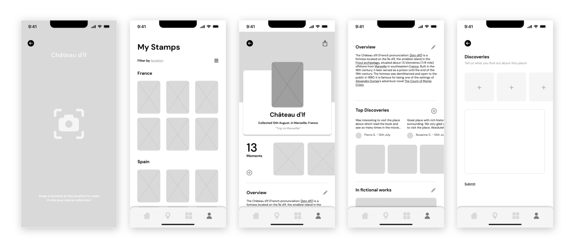
How might we make on-the-go discovery meaningful?
Challenges
- Going through information and figuring places to visit on the spot
- Finding events suitable for the time spent in between locations of events
Solutions
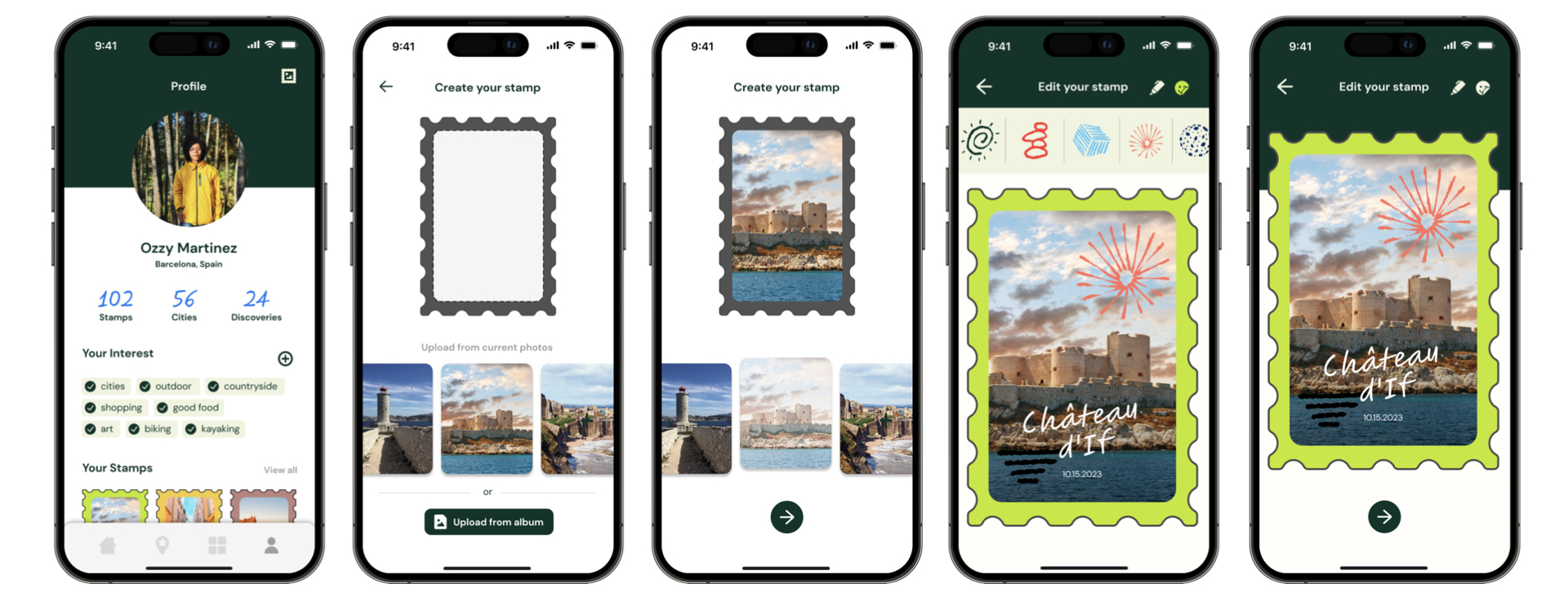
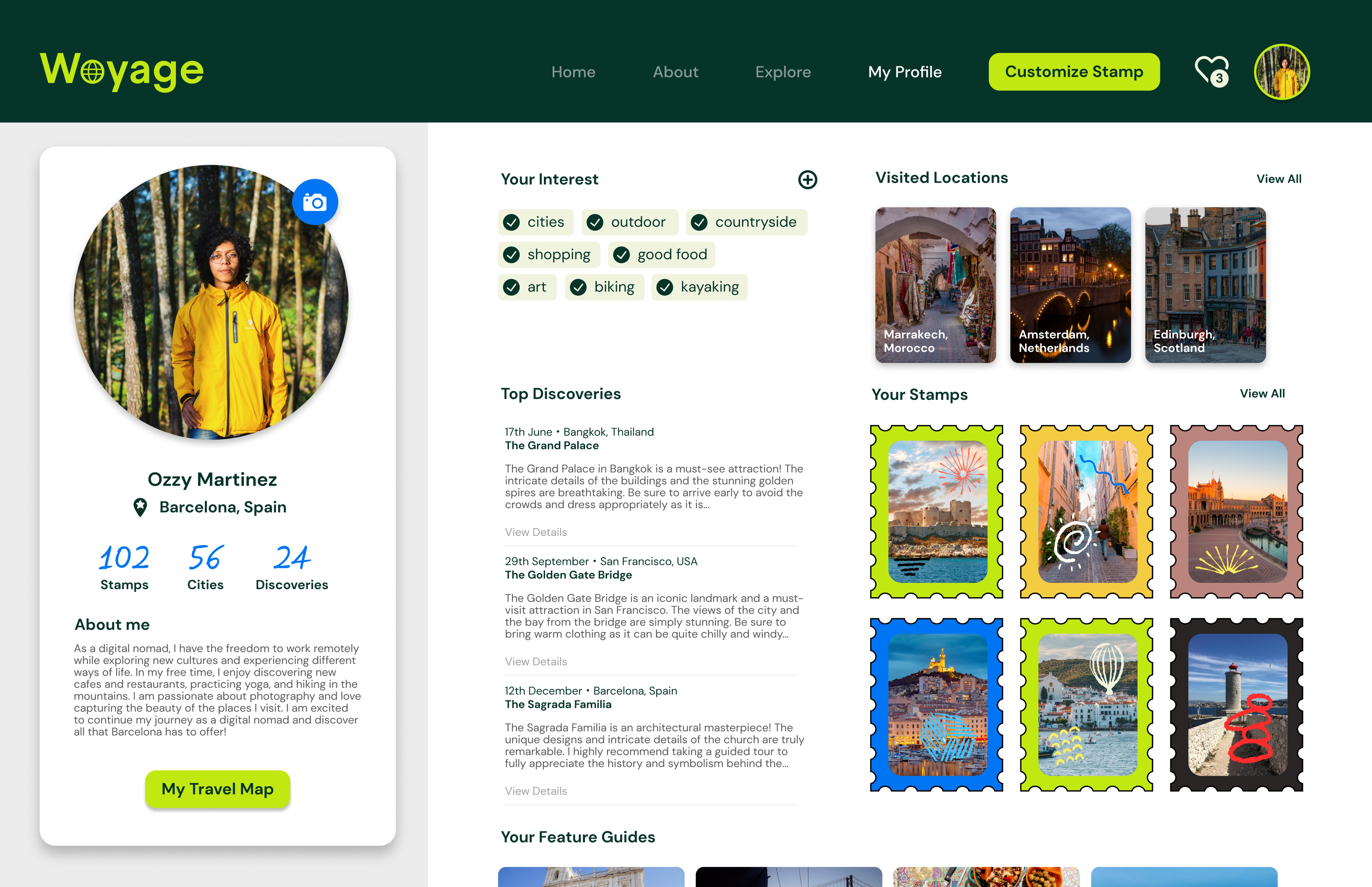
- Stamp system to record moments or customize memories of the location
- AI system to organize photos by location
- Nearby feature to discover locations catering to the user’s interest and time remaining in between events
- Custom tags to filter events
User Insights
- Most people had questioned where the “hearted” objects will be located; They were also confused about the use of the “folders” tab
- By rearranging the order of tabs, user can go through a more intuitive planning process. The AI system embedded in the folder system could also help users add saved events to their itinerary.
Wireframes
![]()
![]()
03. After Trip
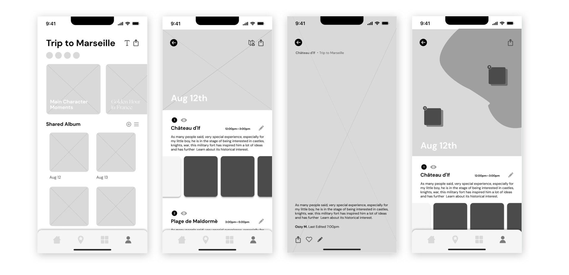
How might we make post trip highlights memorable?
Challenges
- Feel overwhelmed to re-organized highlights of the trip even though wanting to share with others
- Difficult to keep track and review highlights of the trip
- Having to gather photos from peers in the travel group
Solutions
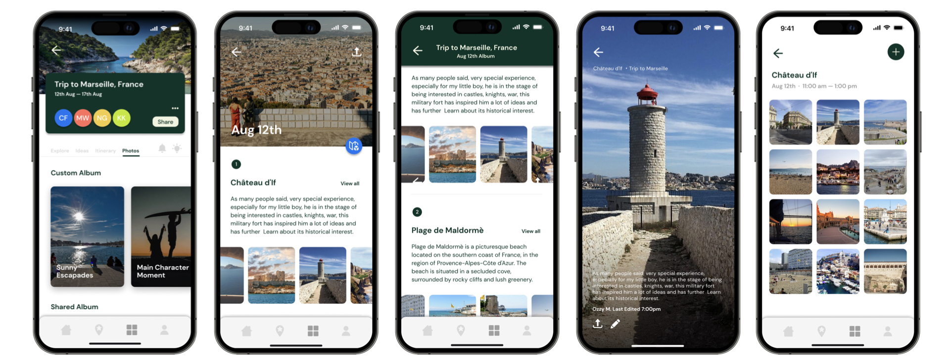
- Sharing album with friends and family and re-visiting trip major moments together
- Inspire users to check out highlights with a friendly tone of voice, and custom typography for each highlight., and custom typography for each highlight
- Arrange photos by dates and locations.
- Customize captions and albums to help remembering major moments of the trip
User Insights
- Most people find the album feature underwhelming, hidden within the itinerary tab.
- By including it under the trip page as one of the major tabs, it makes the process of organization from pre-trip, during-trip, and post-trip, connecting more seamlessly.
- The switch of the navigation bar while scrolling down also helps the user remember the album they are currently on.
Wireframes
![]()
![]()
Next Step...
The Woyage Website
- Expanding on the Wikimedia’s nearby map feature
- Linking Wikipedia information under different locations, making content more engaging and exploratory
- Filtering to view stamps created by other users by time and categories
- Bridging the community to share exploration experiences


Special Thanks: Instructor Paula Seo, mentor Jade Milan