
Shiroiya Hotel Rebrand
The original Shiroiya Ryokan was in danger of being demolished but was saved by a 2014 city regeneration project. After six and a half long years of renovation by the executive designer Sou Fujimoto and six internationally-acclaimed participating artists, it was reborn as Shiroiya Hotel in December 2020.
︎︎︎
Mission Statement
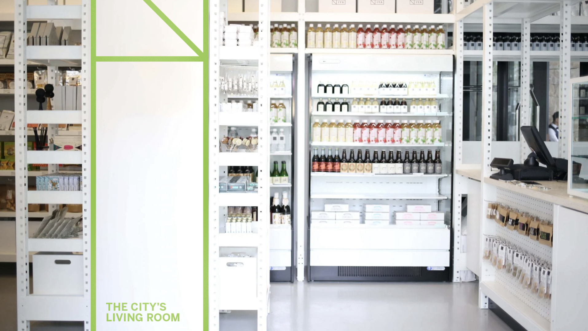
Shiroiya Hotel focuses on creating a diverse and interactive experience to gather people of different cultures in the “City’s Living Room”. The goal of this identity system that will embrace the past, present and future stories in the community, enabling new visions, collaborative projects of art & culture to be shared across guests and locals.
Shiroiya Hotel focuses on creating a diverse and interactive experience to gather people of different cultures in the “City’s Living Room”. The goal of this identity system that will embrace the past, present and future stories in the community, enabling new visions, collaborative projects of art & culture to be shared across guests and locals.
︎︎︎
Strategy
01.
Enhance
Collaboration
Inspired by the structure of Shiroiya Hotel of the dismantled floors and remaining pillar, then added on plants and art to transform it into a unique space—It is all about how these distinct qualities harmonize each other. A rebrand would bringing in international and local community together, reaching out to international audience and designers to be involved in the future of the hotel.
02.
Highlight Art & Culture at Shiroiya
Various artworks decorate the two buildings of Shiroiya Hotel as inspired by design director Sou Fujimoto's concept of blending "old" and “new”. Visitors are suggested to follow the art map provided by the hotel to navigate their own journey and experience. Providing a highlighted and clearer visual system would improve the experience.
03.
Celebrate History and Development
As Shiroiya will go on developing, together with the entire city of Maebashi, the rebrand would involve the local community by accepting and involving a diversity of people, activities and materials. The rebrand will reflect on the history of the city while seeking for new possibilities.
︎︎︎
Logo & Brand System
There are three core concepts to the spatial context logo: the outer frame with the weaving pattern, inside diagonal referencing the criss crossing staircase in the architecture, and the main concept is Shiroiya Hotel being the City’s living room.


︎︎︎ Tagline & Color System
The colors are inspired by the surrounding nature, traditional Japanese weaving colors, and artworks done by commissioned artisits for the hotel.


︎︎︎
Postcard
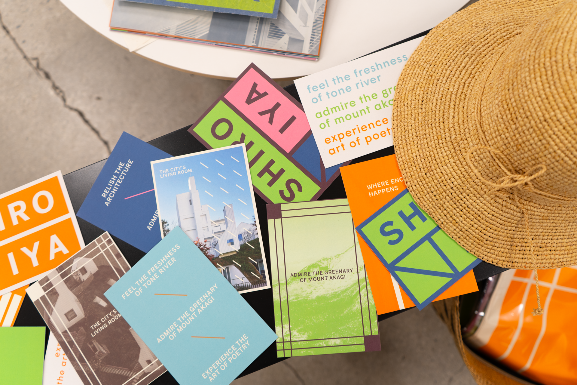
The postcard gives an extensive insight on how the visual language is grown into connection of words in smaller formats, and elements you can find surrounding the hotel. This is provided as a warming gift to the visitors.


︎︎︎
Lookbook
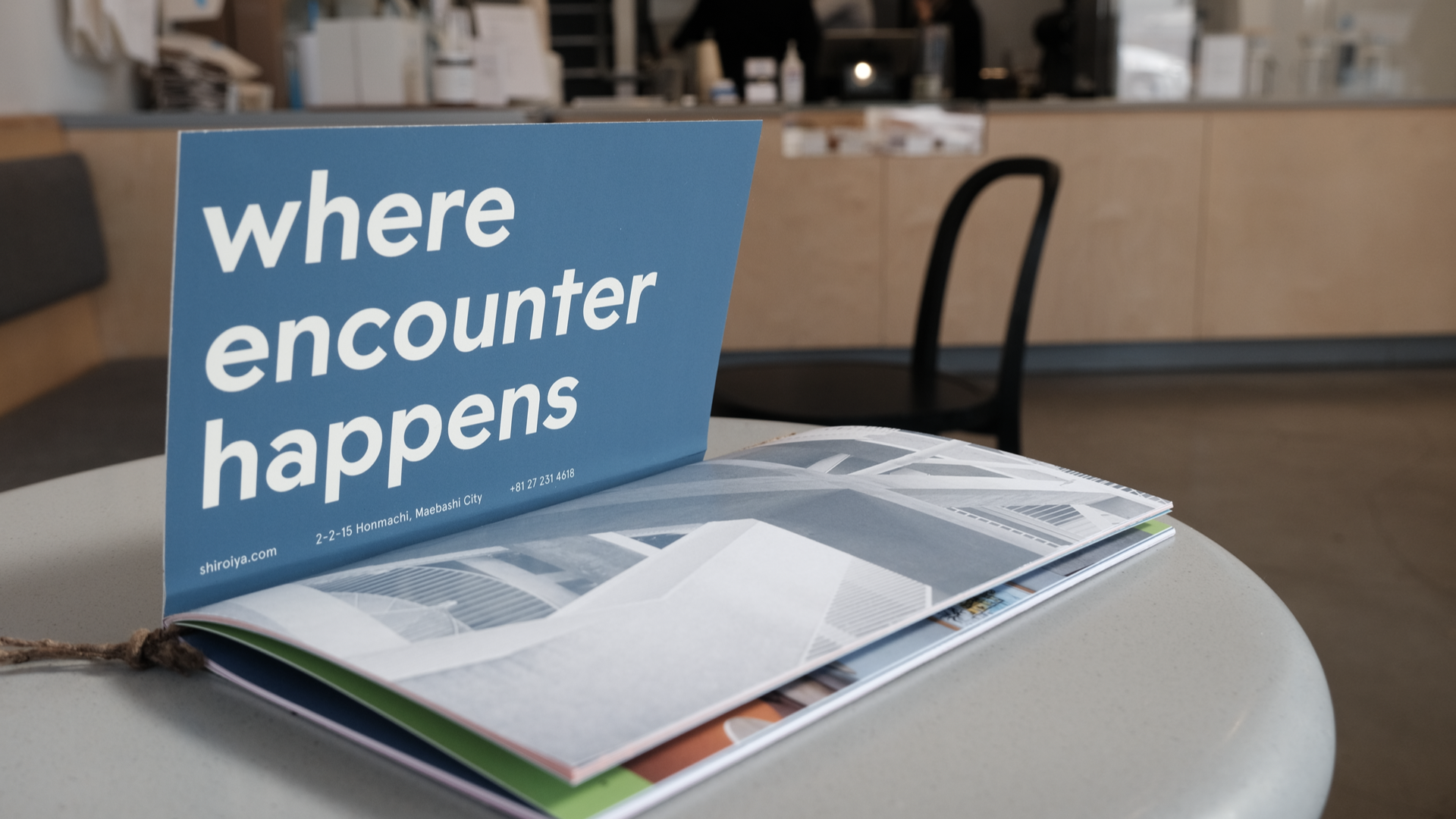
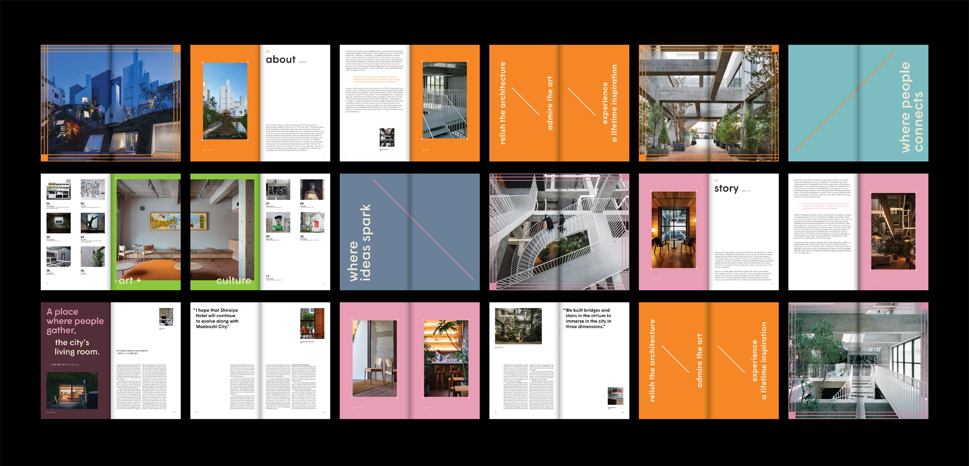
The lookbook pin-points the unique aspects of the hotel such as art and design and the historical background of the city’s richness in its weaving industry.



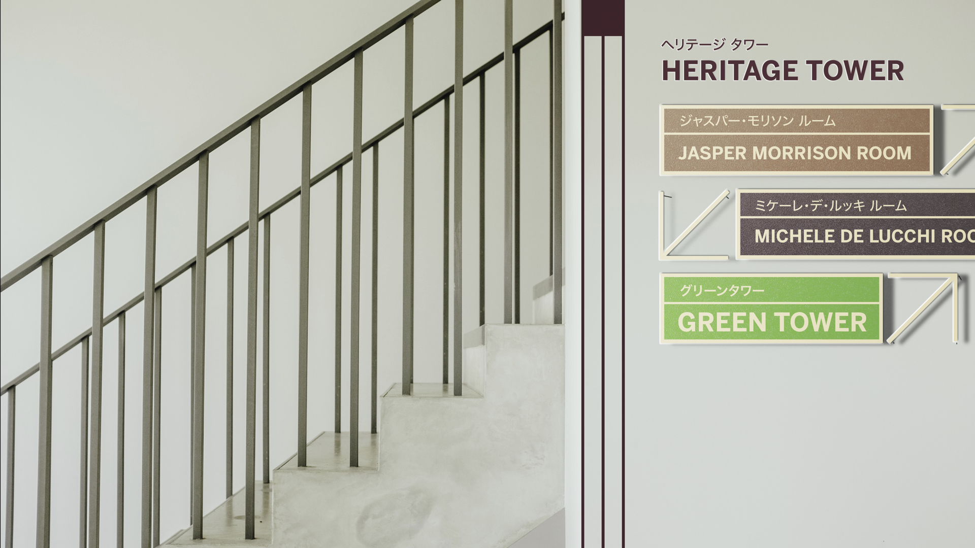
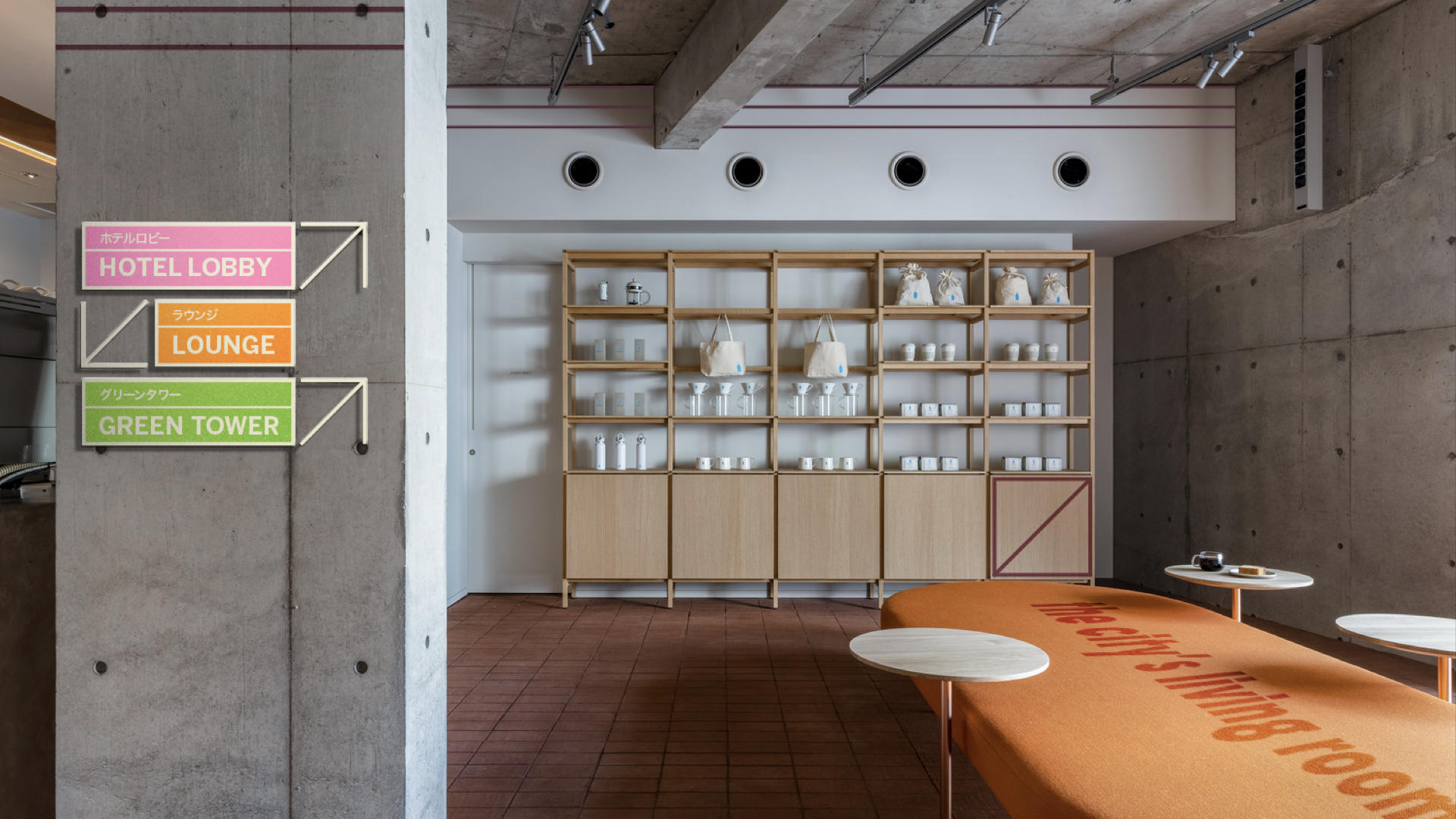
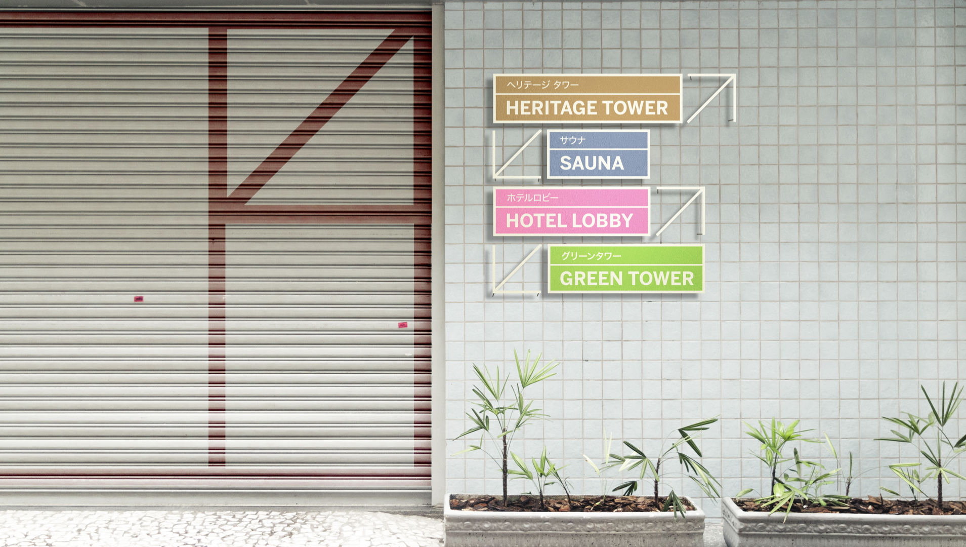
︎︎︎ Spatial & Wayfinding
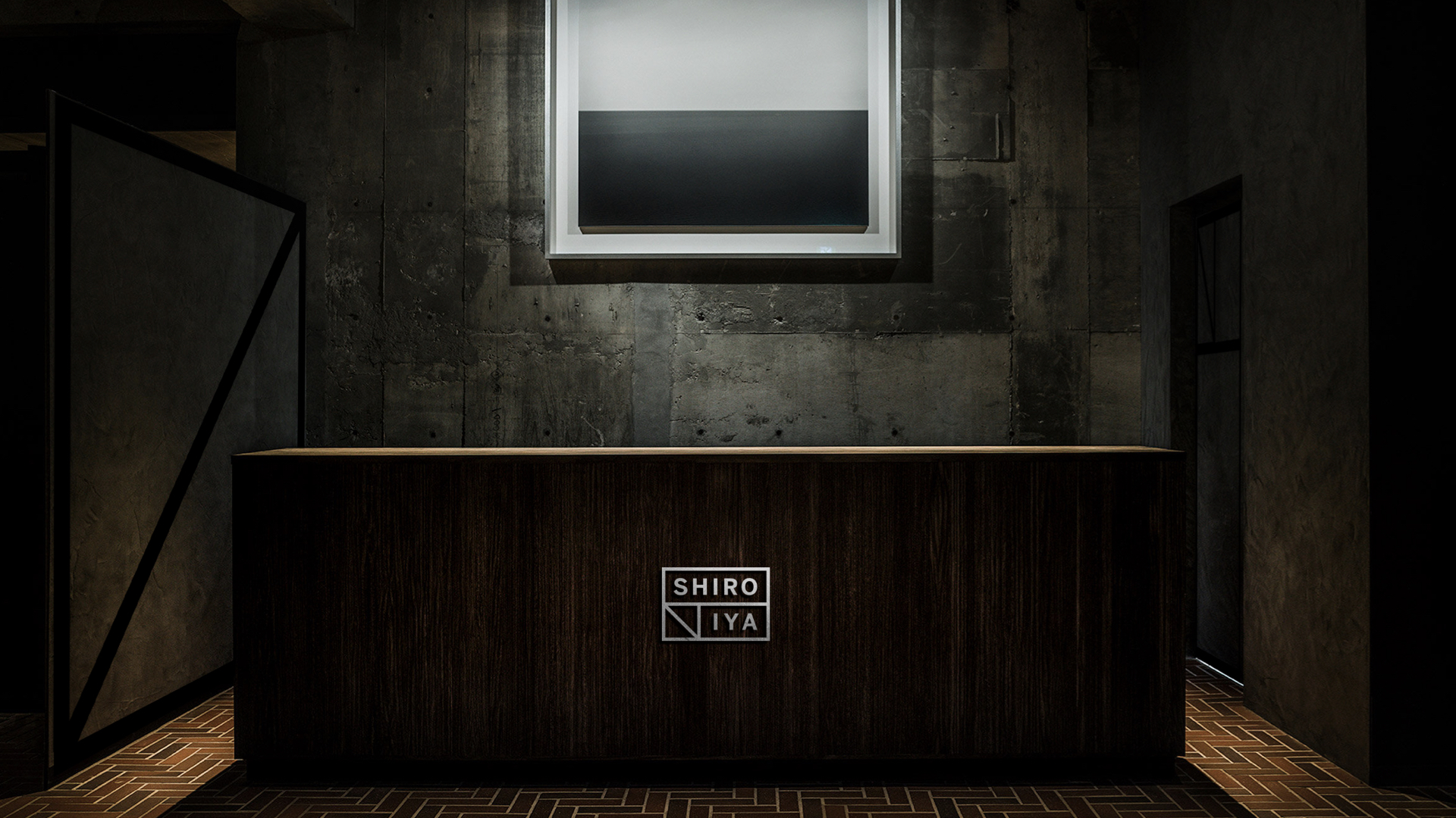
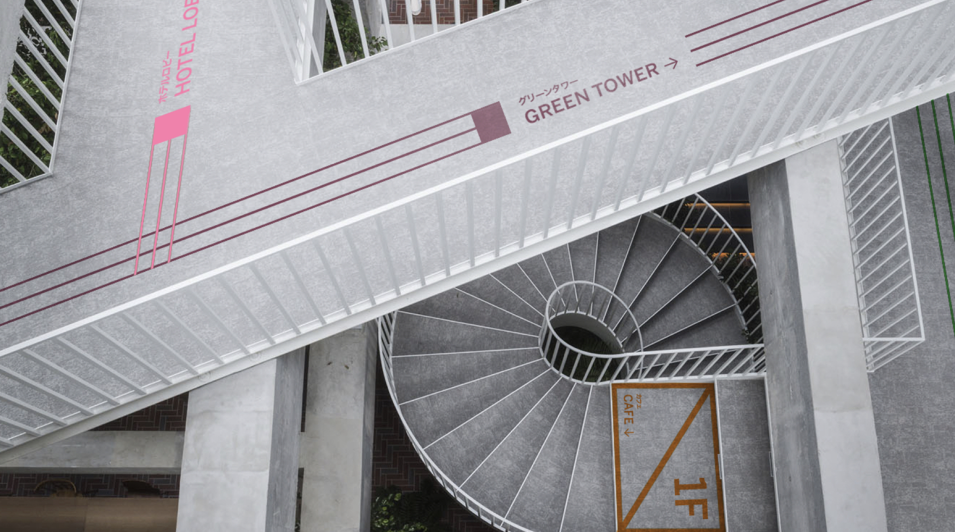
Wayfinding system enhances the spatial experience & defines the harmony between design and the architecture of the hotel.
︎︎︎
Collaterals
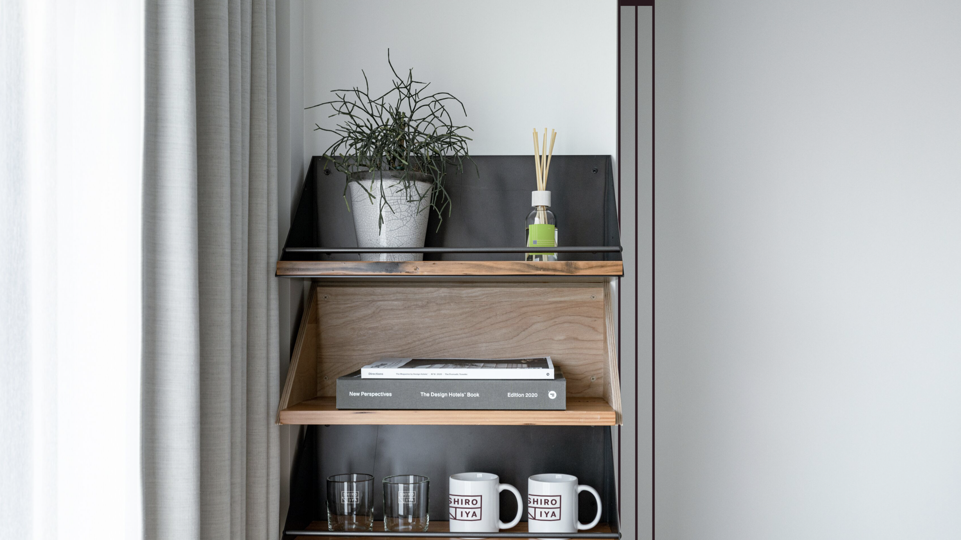
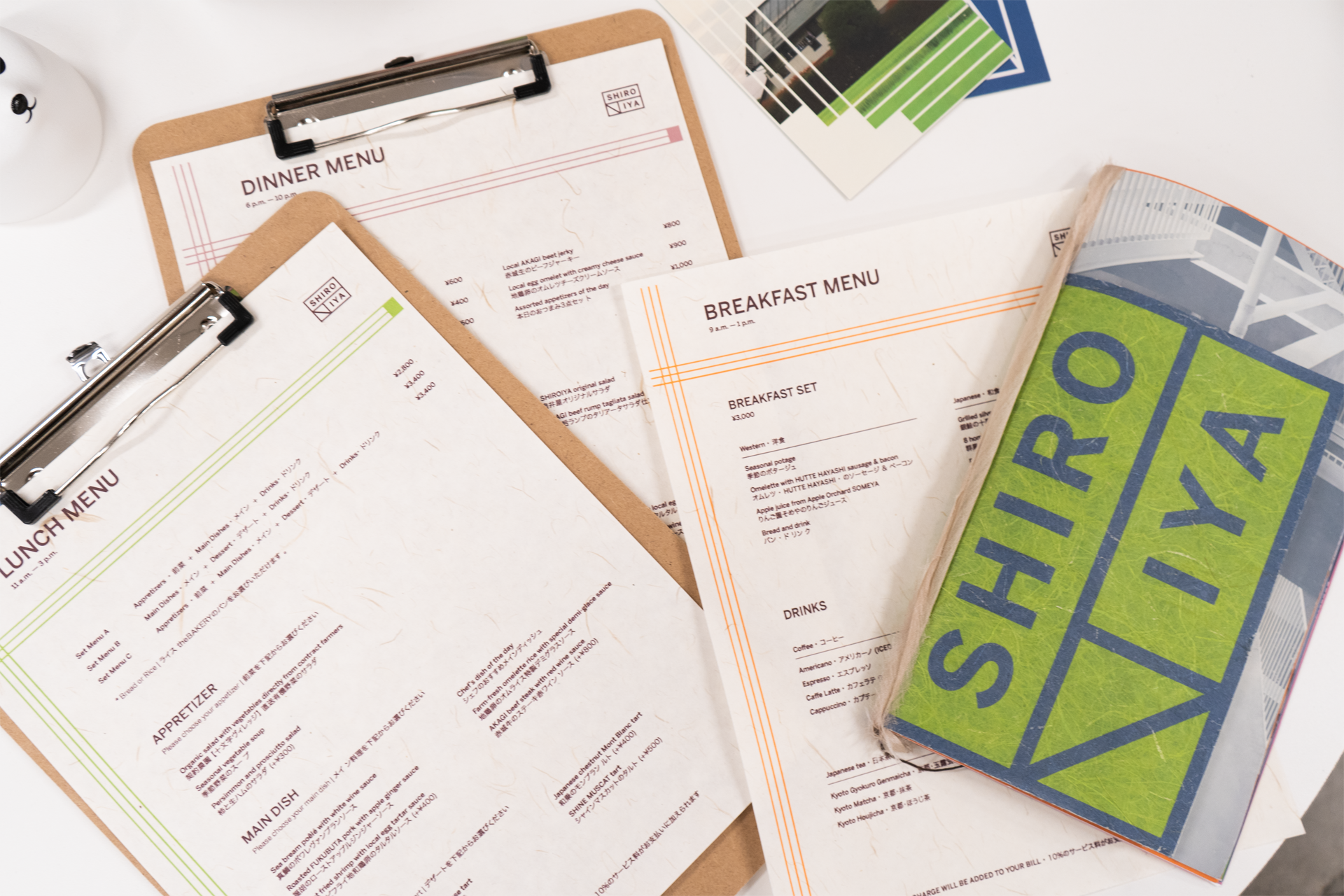
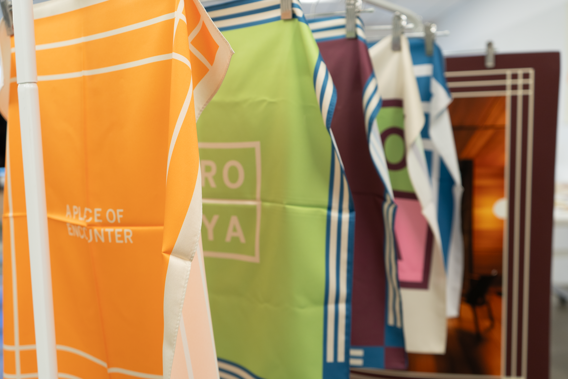
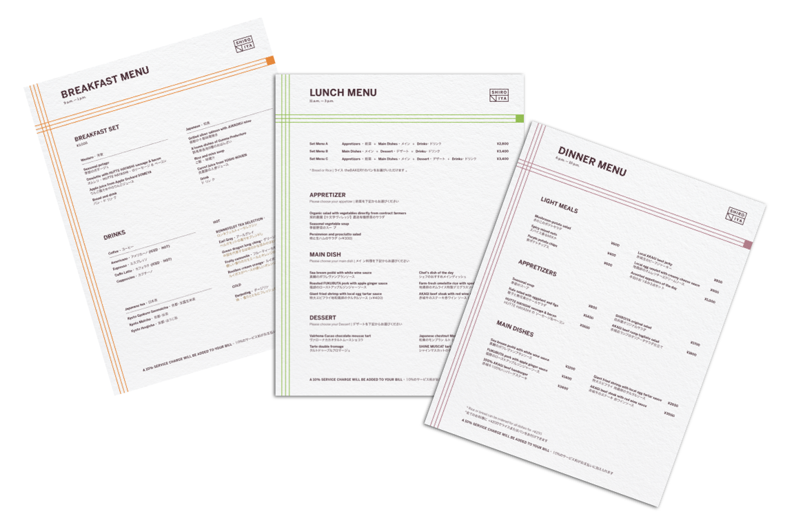
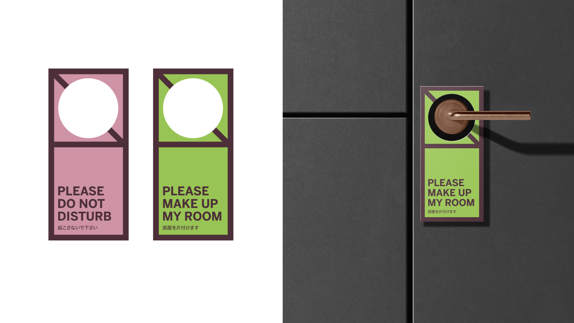
Capitalizing Maebashi’s rich history in its textile industry, special attention is put to the products distributed and sold inside the hotel. Handweaving, silk screening and printing are used to bring warmth and welcoming spirit to the visitors.






︎︎︎Promotional Video
︎︎︎Website
The website highlights each unique room and visitors can reserve rooms directly for their visit. They can also get more informations on events and history of the hotel.
︎︎︎Social Media & Poster

︎︎︎Next Step:
Shiroiya Information Panel
To enhance to navigating experience around the hotel, an information panel is proposed to place at the lobby. The prototype demostrate how one might activate the panel, and find information.