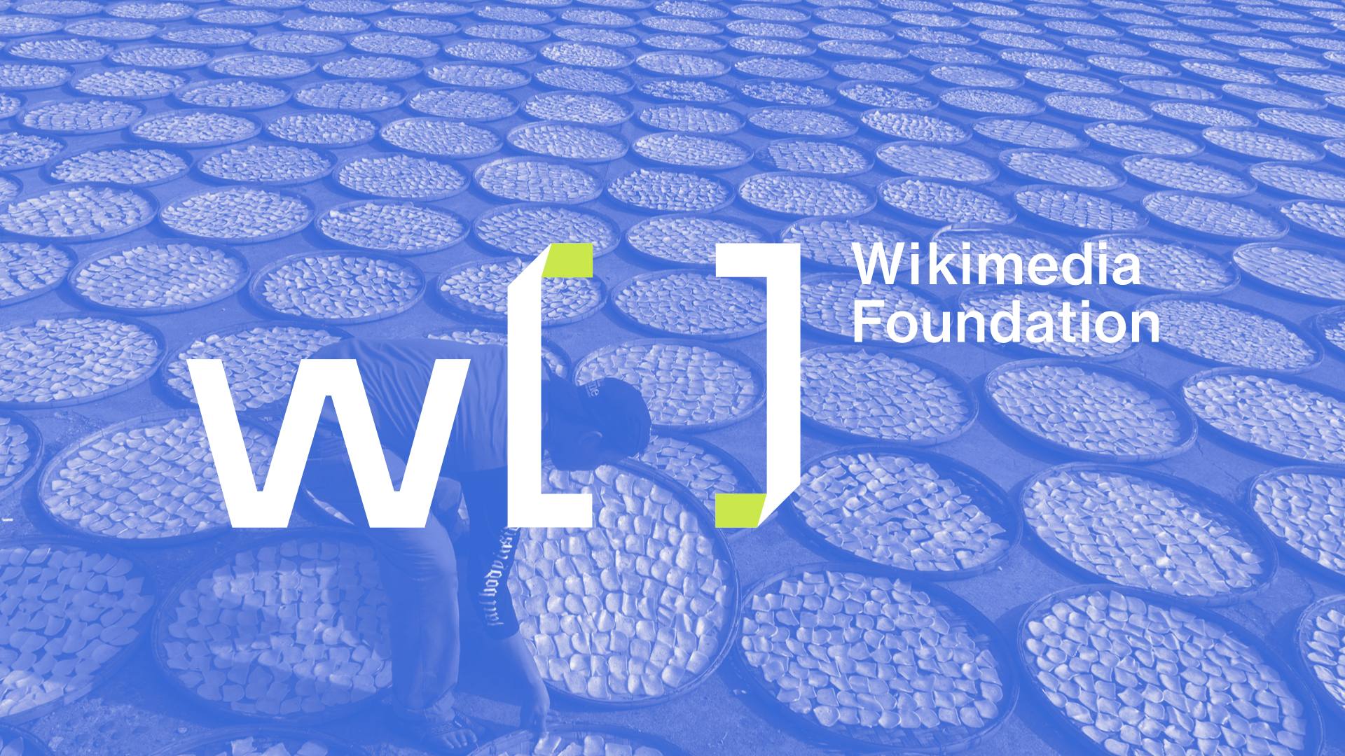
Wikimedia Foundation
The Wikimedia Foundation supports hundreds of thousands of people around the world in creating the largest free knowledge projects in history. The rebranding helps to bring forward to digital as well as physical presence of the Wikimedia and create a coherent system across all experiences.
Type
Solo Project, Visual Identity, Art Direction, Motion Design
Solo Project, Visual Identity, Art Direction, Motion Design
︎︎︎ Mission Statement
My rebrand for the mission of the Wikimedia Foundation is to empower and embrace diversity, engage people around the world to collaborate and develop authentic educational content with the freedom of open-sourced knowledge, and to share it effectively and globally with a seamless visual experience.
My rebrand for the mission of the Wikimedia Foundation is to empower and embrace diversity, engage people around the world to collaborate and develop authentic educational content with the freedom of open-sourced knowledge, and to share it effectively and globally with a seamless visual experience.
︎︎︎ Rebrand Focuses
01. Focusing
Clearer information structure to assist readers and editors to work more efficiently, ensuring every voice are heard.
02. Bridging
Connecting the community, between different regions, readers to editors, the volunteers and the foundation, expert vocabularies and community description.
03. Revitalizing
Building trust on providing reliable resources, partnering with GLAM institutions and philanthropic foundations.
04. Expanding
Providing educational programs, methods for immersive technology as well as offline options to access to materials.
︎︎︎Motion Montage
︎︎︎Tagline
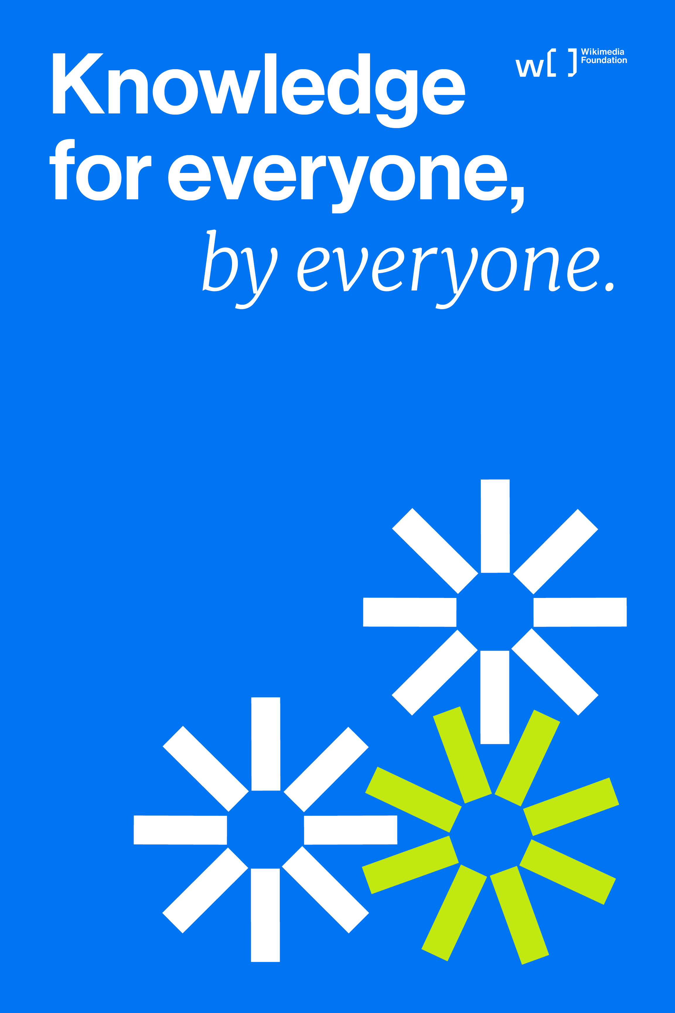
My strategy on primary tagline speaks to the accessibility of Wikimedia, being the platform to contribute and review by millions of people around the world.

︎︎︎ Logo System
My concept was driven by the idea of simplifying and providing clarity for Wikimedia being a platform “containing” various aspects of knowledge and interest. The hint of green in the bracket shows a sense of dimension symbolizing Wikimedia’s outreach to physical events.

︎︎︎
Color Palette
I have created the color “Knowledgeable Blue” in reference to the analogy of “ocean of knowledge“, covering the versatility and broadness of Wikimedia.

︎︎︎Graphic System
In order to simplify this complex brand, I have used the bracket as a flexible component that contains various contents and topics of the brand, such as container for photography, or highlights of major moments.

︎︎︎ Iconography
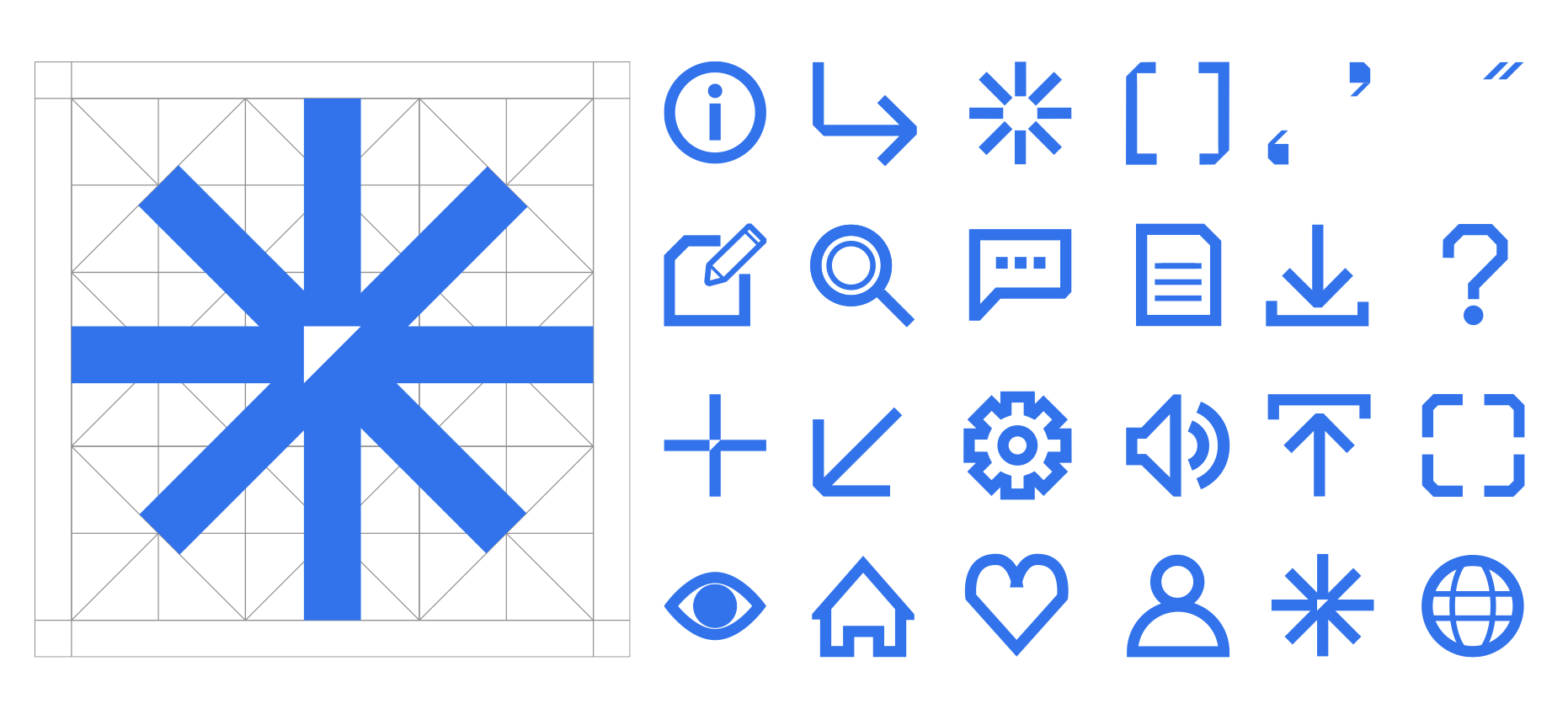
Going from the big to the small, I also created a set of icons to extend the visual language, so readers can feel the friendliness of the brand in the smallest detail. The iconography is also designed to be used in both digital and physical space.
︎︎︎ Poster
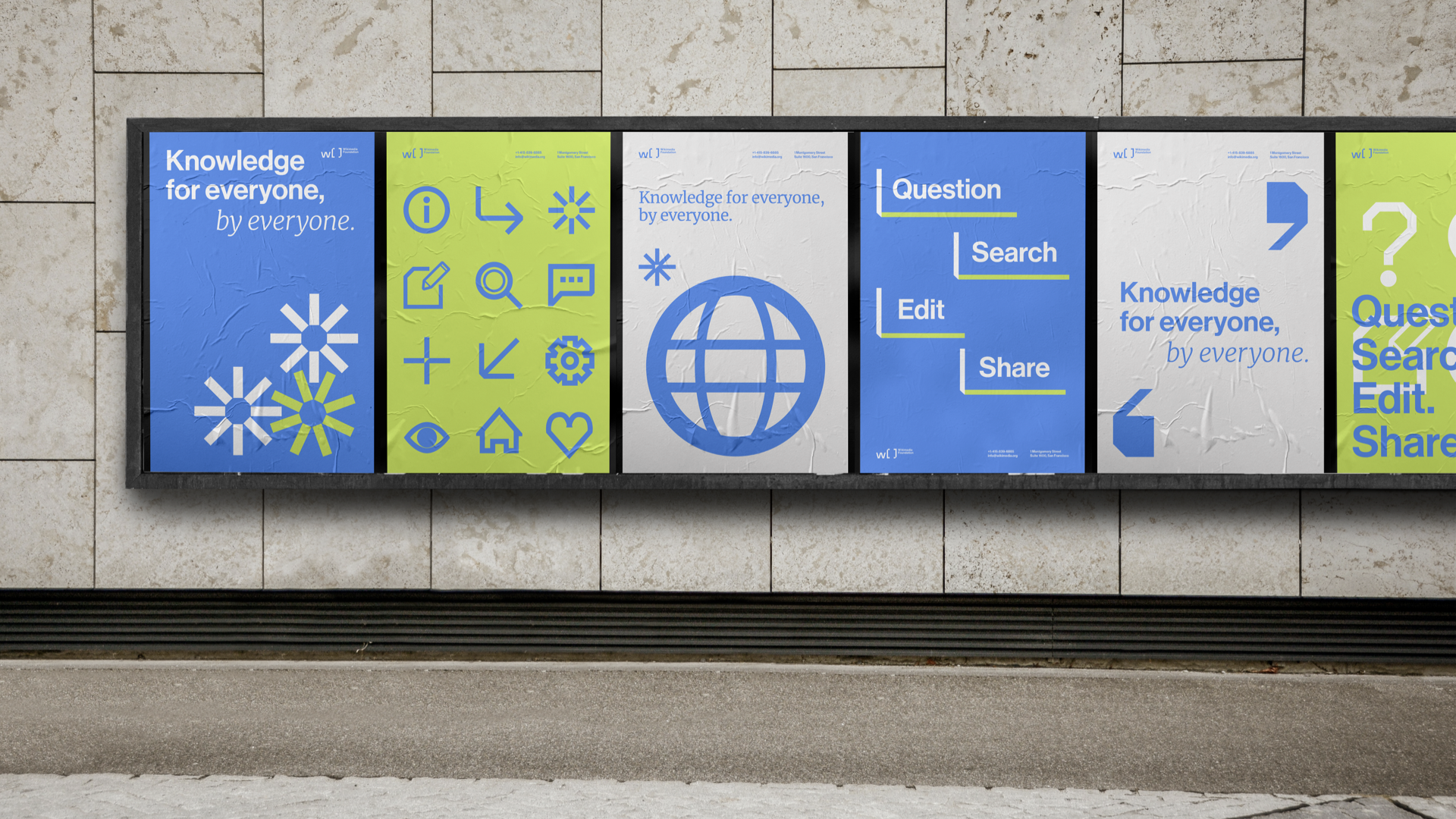
My goal is letting Wikimedia be the jumping point to spark the interest of the readers leading to other platforms. Hence this led to me strategizing with the tagline “question, search, edit, share” that covers the major touchpoints of the brand.




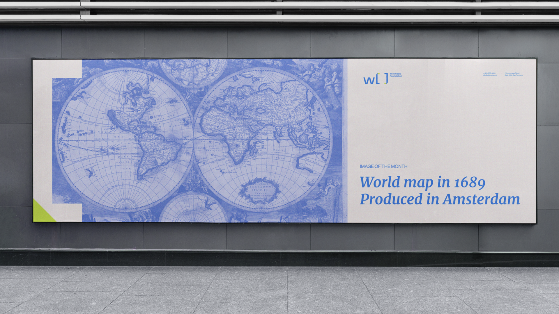
︎︎︎Content Posters
In addition to the brand posters, the rebrand also focuses on other aspect of Wikimedia including discussion panels, podcasts, and content promotion of their major platforms like Wikipedia and Wikimedia Commons.





︎︎︎Website


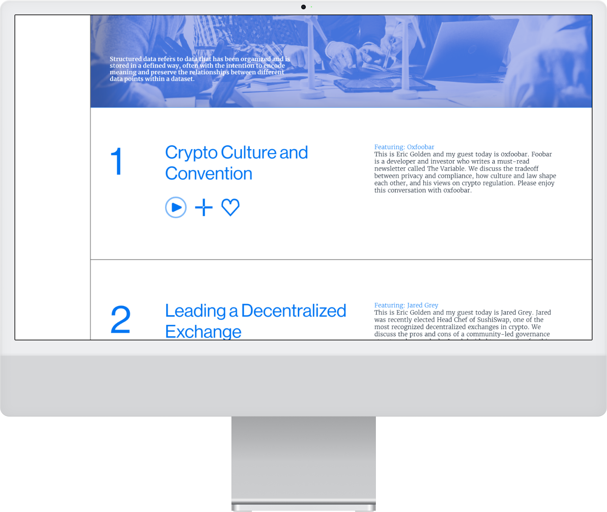
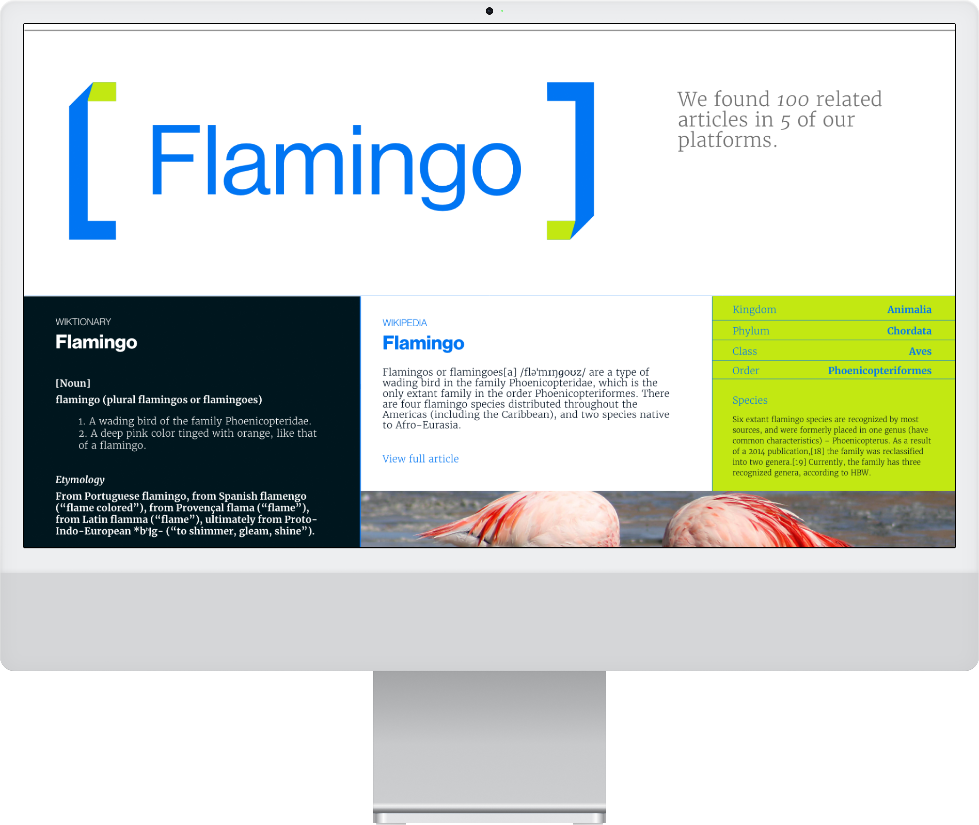
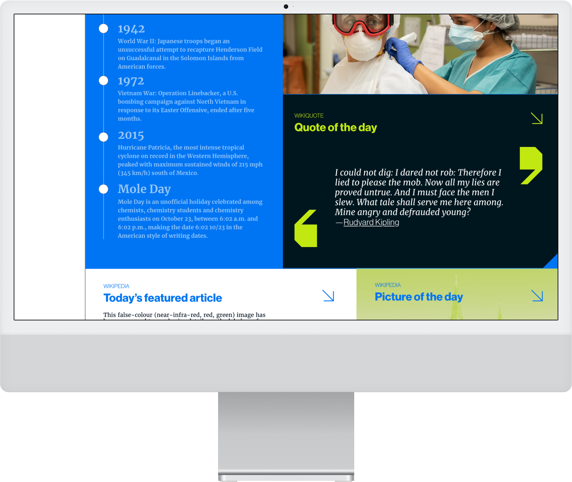

︎︎︎Social Media
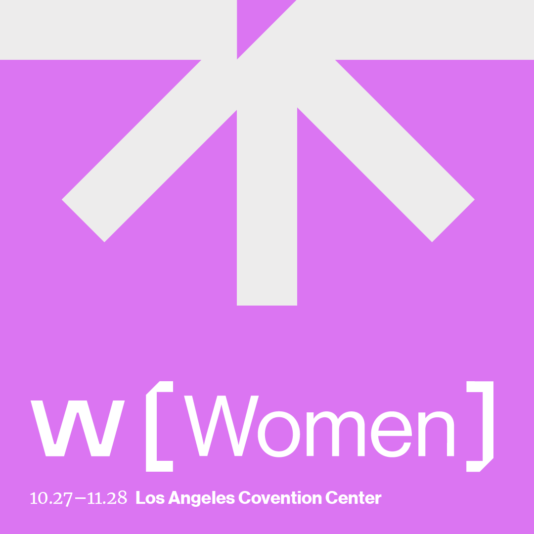
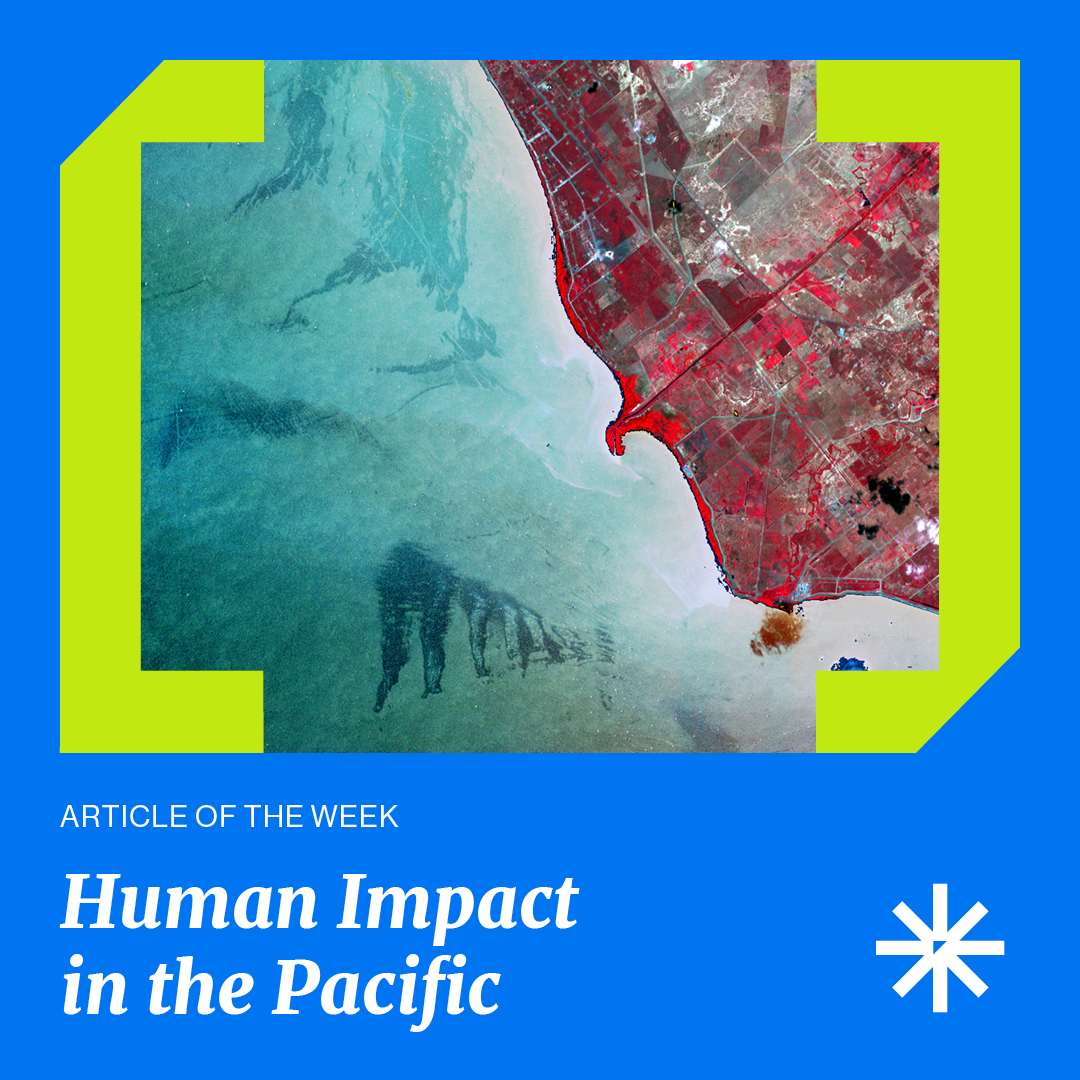
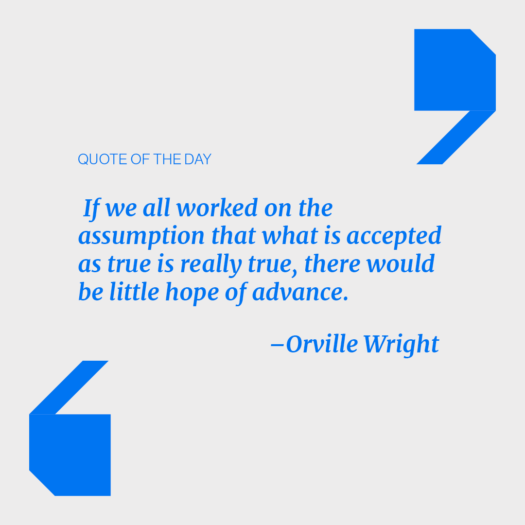
I also curated content for social media, including quotes and podcast series, providing readers with entry points to learn more across all platforms under Wikimedia.



︎︎︎Wiki: Hub
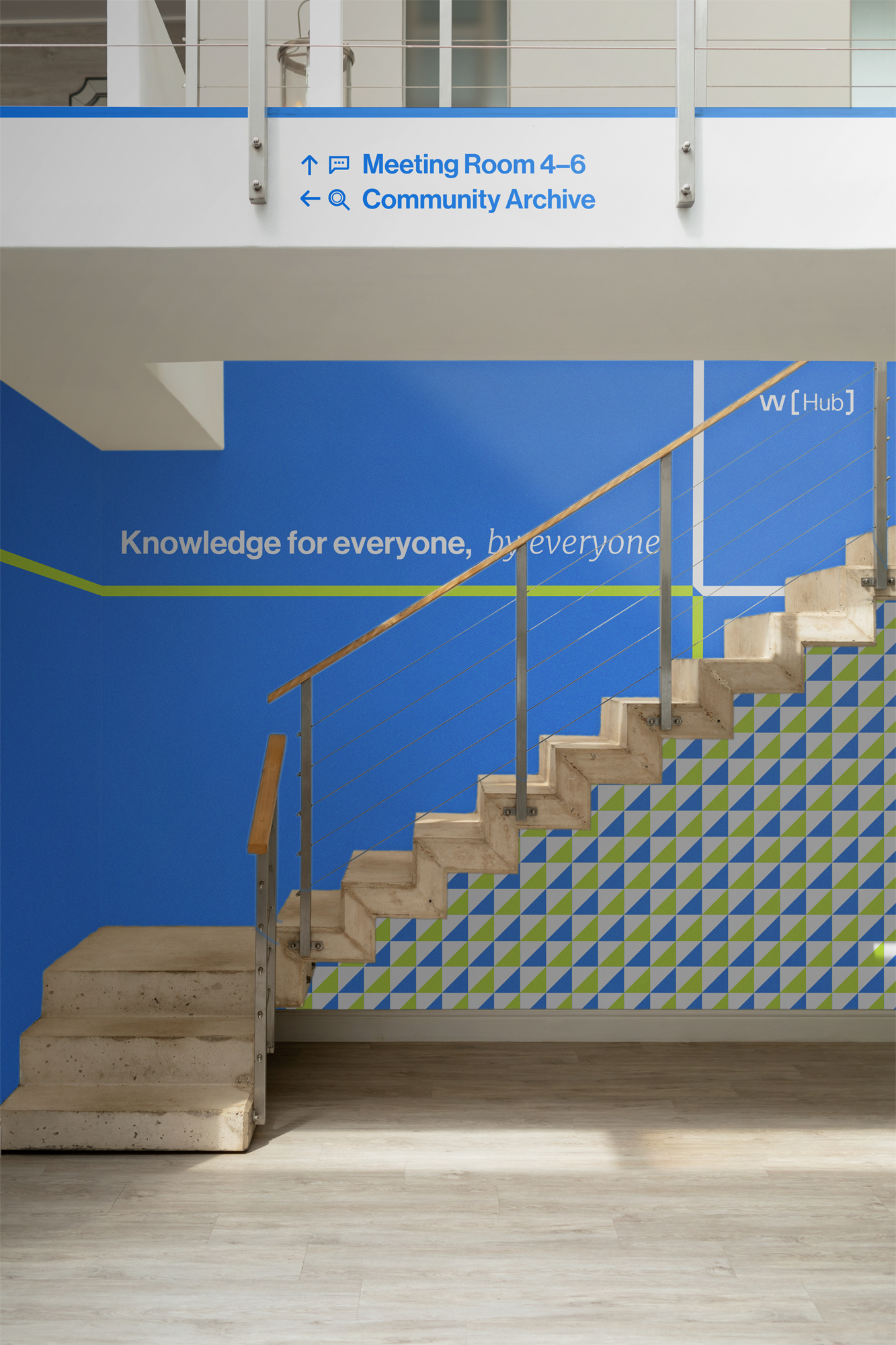
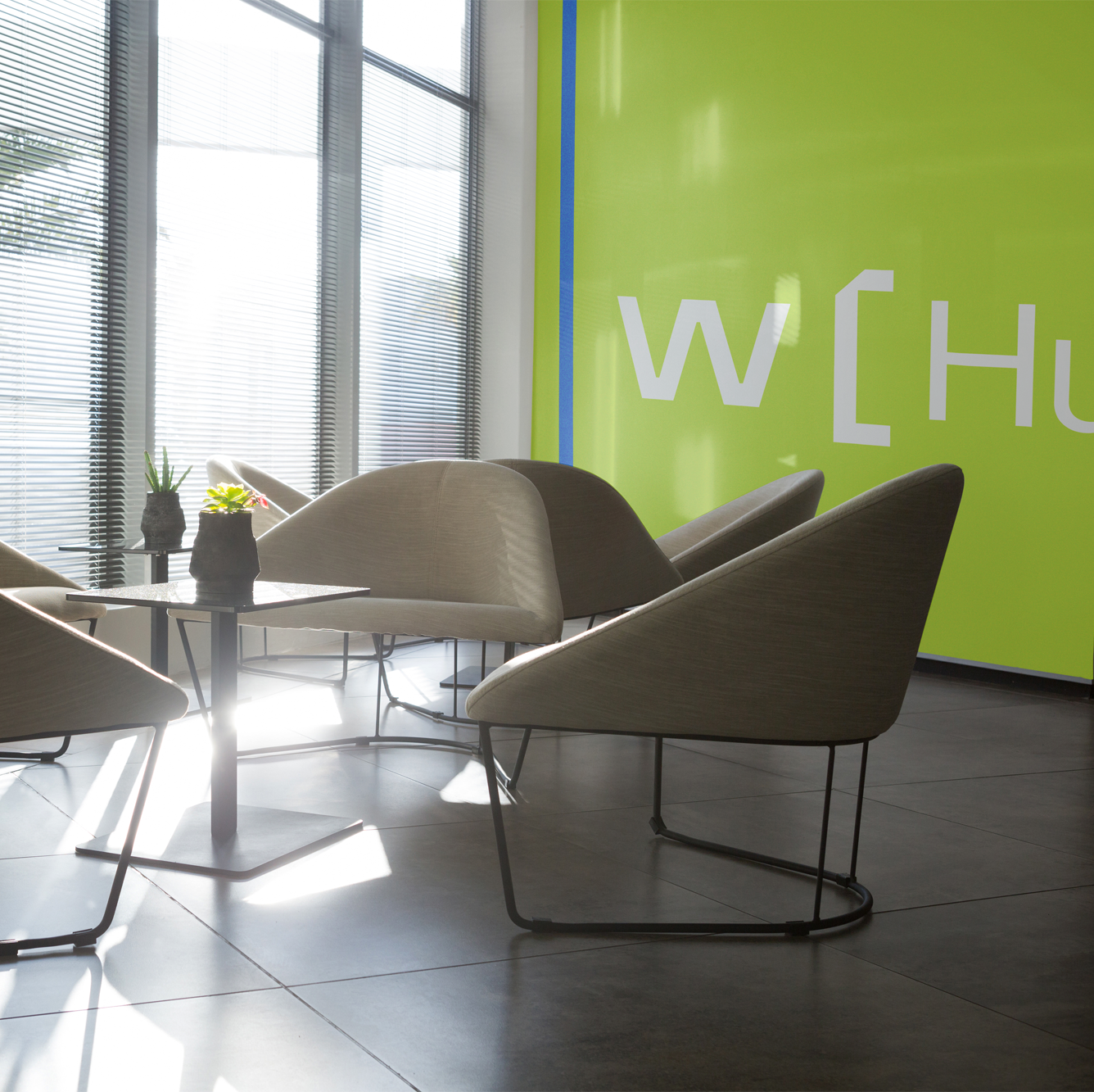
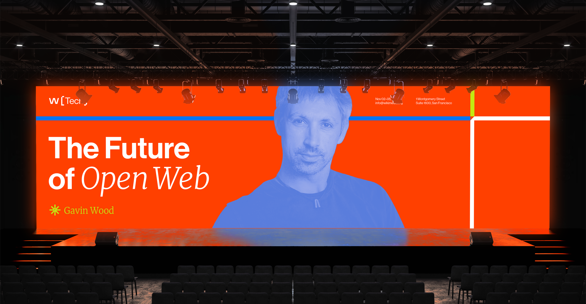
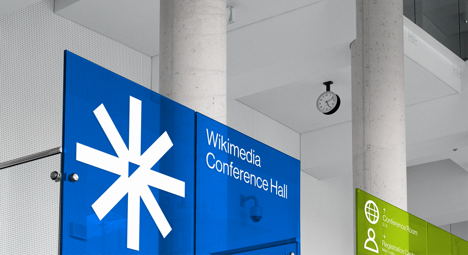
To reframe the brand, I introduced a potential co-working space—Wiki-Hub—to enhance collaboration between readers and editors, revitalizing Wikimedia’s core mission for archival and co-creation of knowledge.

︎︎︎ Wiki: Conference
︎︎︎ Stationeries & Badges


Special Thanks: Instructor Ming Tai